Div+Css布局
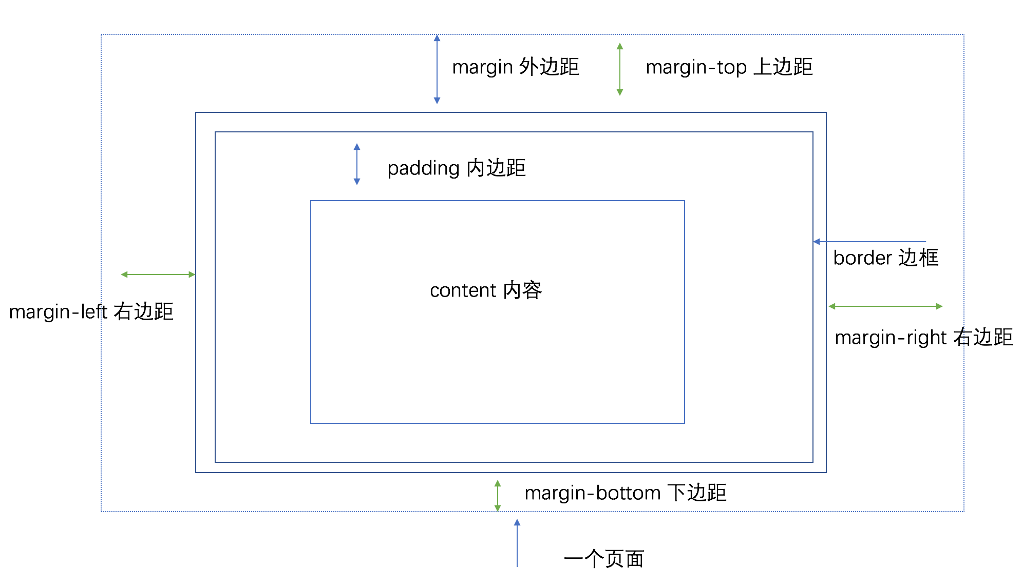
盒子模型
- 所有HTML元素可以看作盒子
- 用来设计和布局时使用
- 盒模型允许我们在其它元素和周围元素边框之间的空间放置元素。
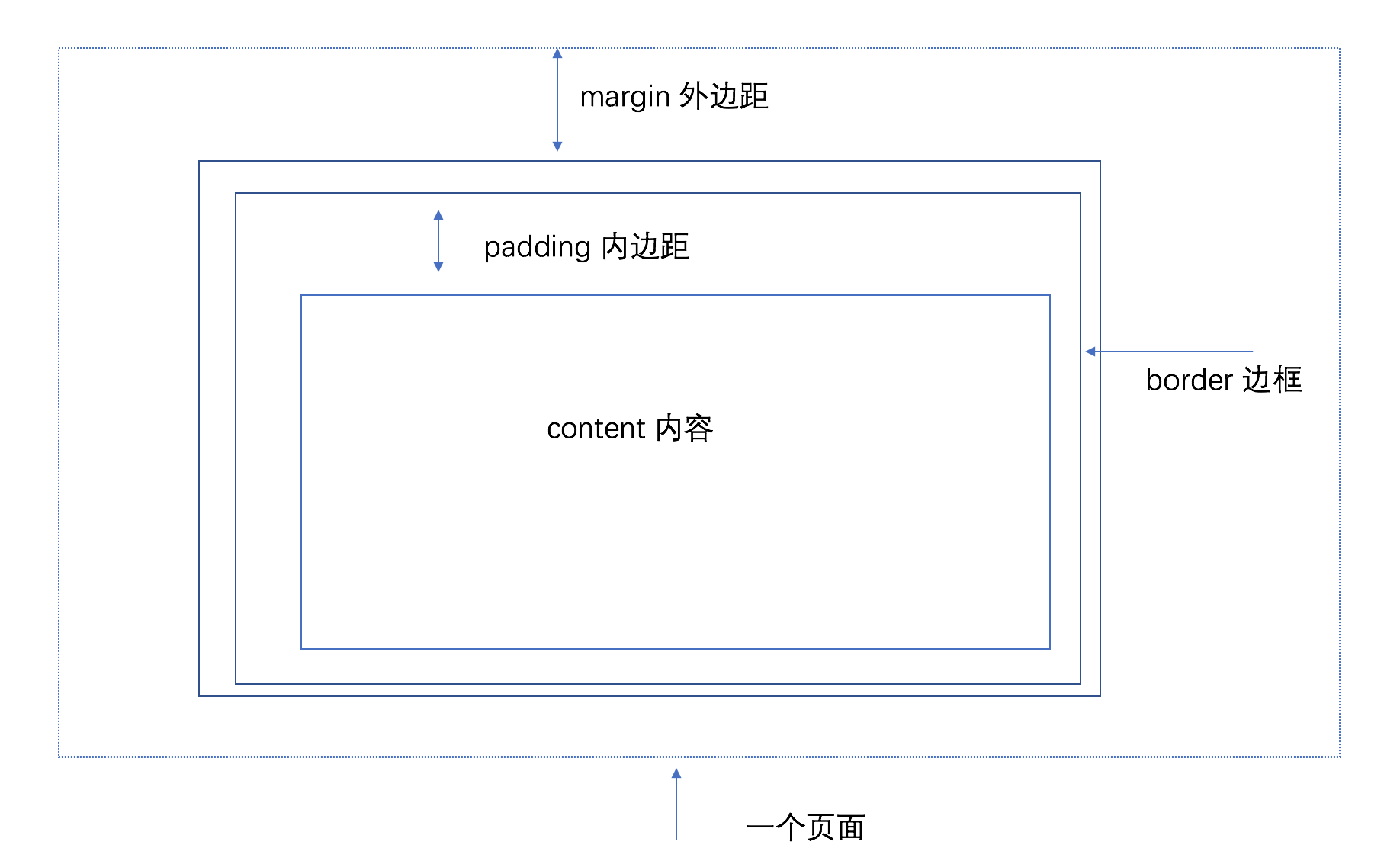
- Margin(外边距) - 外边距是透明的。
- Border(边框) - 在内边距和内容外的边框。
- Padding(内边距) - 内边距是透明的。
- Content(内容) - 盒子的内容,显示文本和图像。
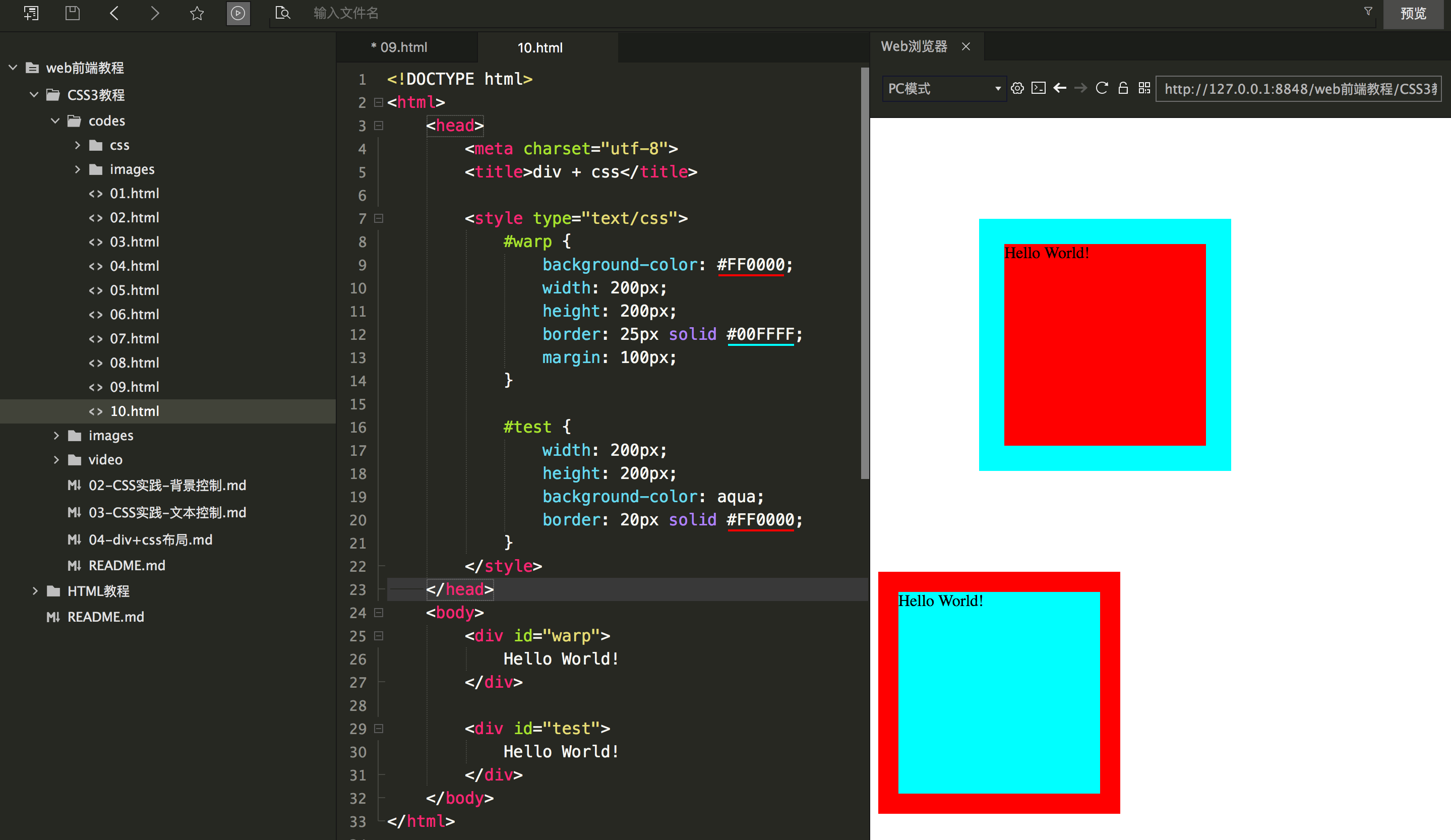
实验代码
<!DOCTYPE html>
<html>
	<head>
		<meta charset="utf-8">
		<title>div + css</title>

		<style type="text/css">
			#warp {
				background-color: #FF0000;
				width: 200px;
				height: 200px;
				border: 25px solid #00FFFF;
				margin: 100px;
			}

			#test {
				width: 200px;
				height: 200px;
				background-color: aqua;
				border: 20px solid #FF0000;
			}
		</style>
	</head>
	<body>
		<div id="warp">
			Hello World!
		</div>

		<div id="test">
			Hello World!
		</div>
	</body>
</html>
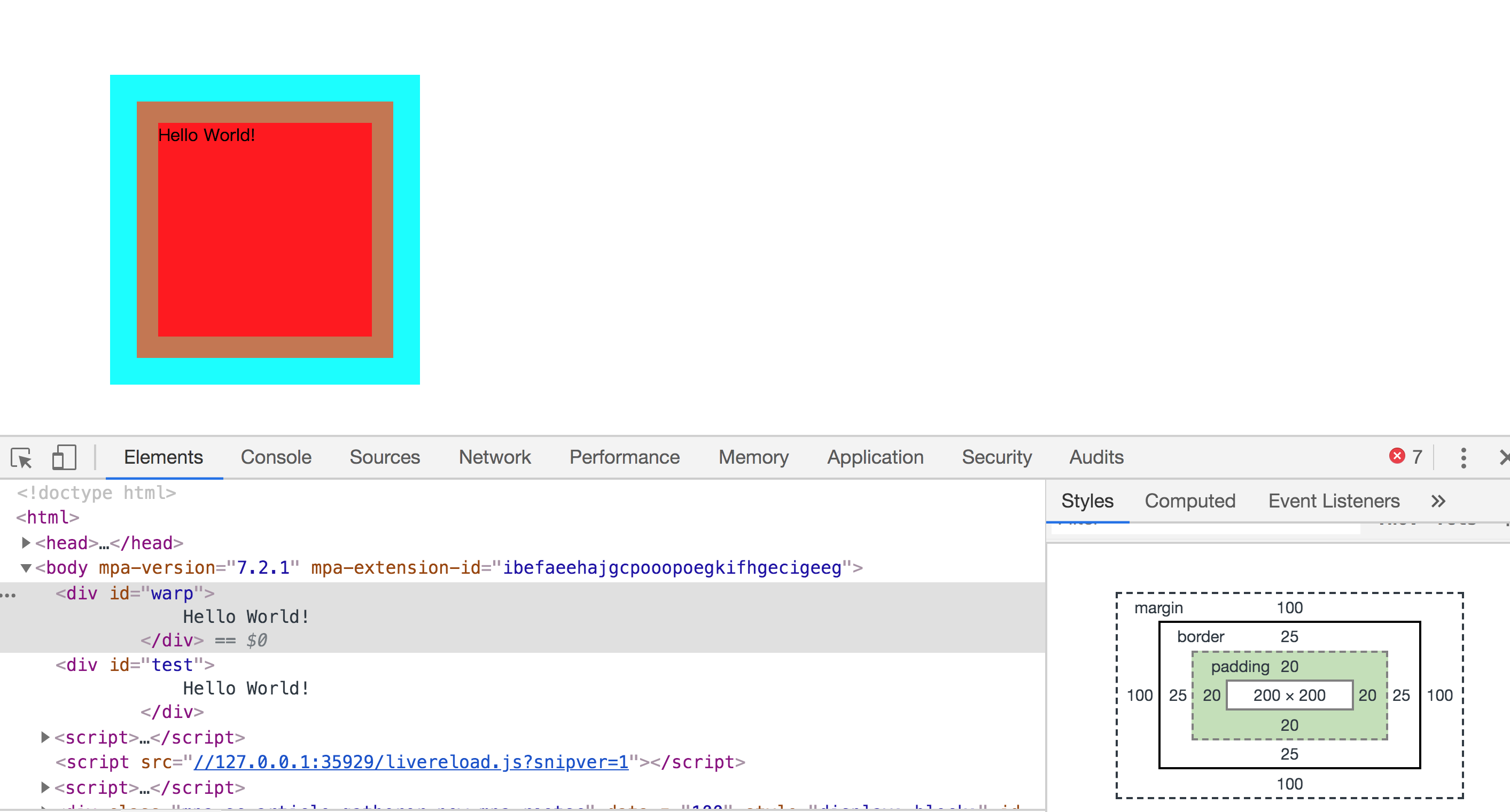
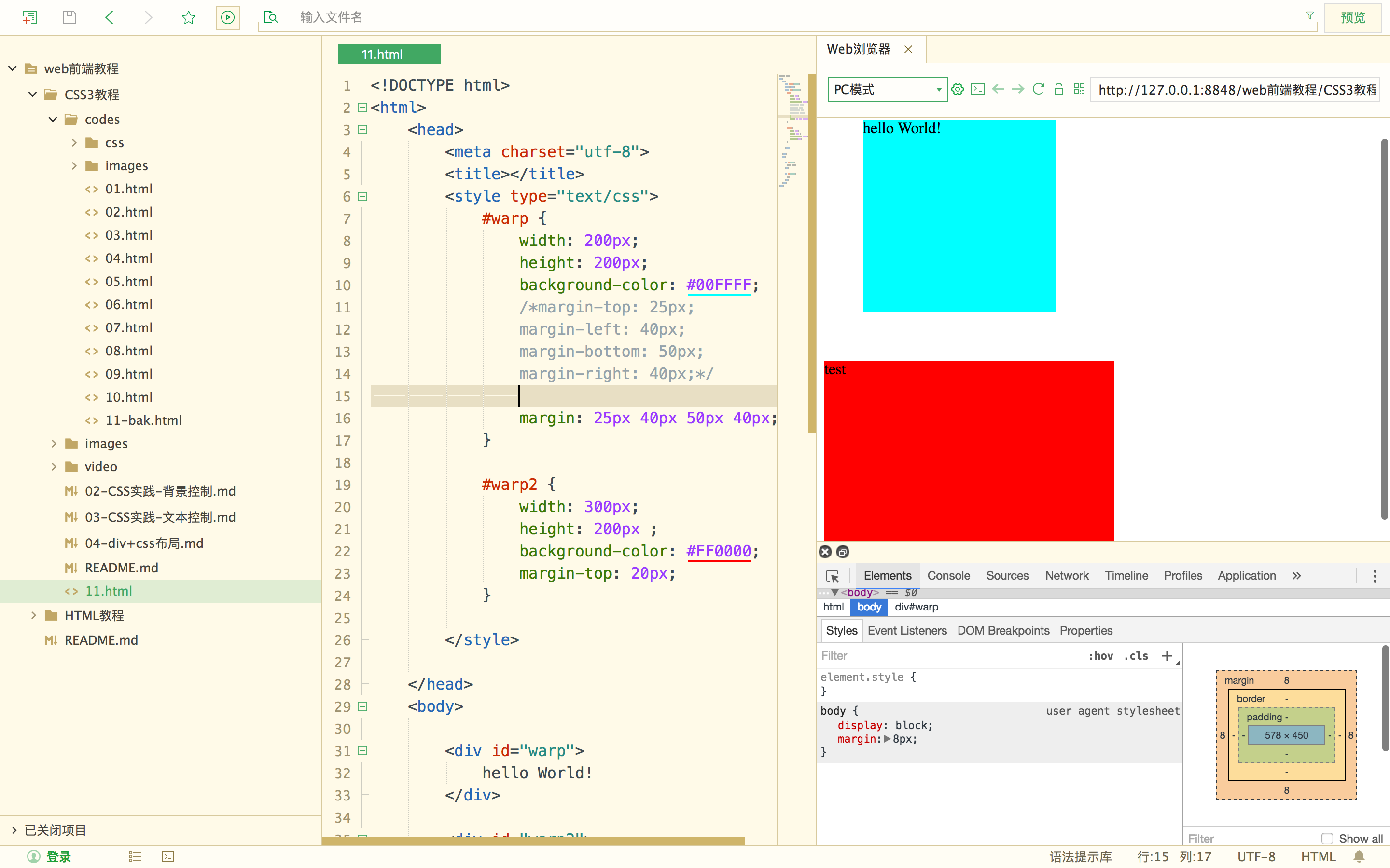
实验效果
在开发工具中调试
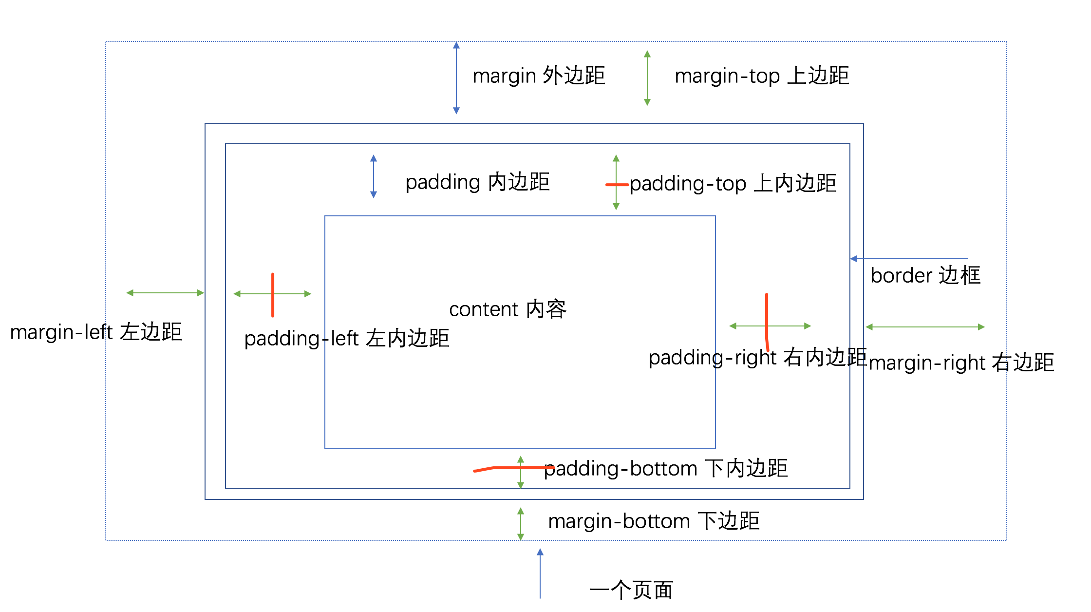
margin 外边距
- margin-top 上边距
- margin-bottom 下边距
- margin-left 左边距
- margin-right 右边距
- margin 上右下左 (四个值)
- margin: 10px ; 生效所有的margin
- margin: 10px 20px ; 上下 左右
实验代码
<!DOCTYPE html>
<html>
	<head>
		<meta charset="utf-8">
		<title></title>
		<style type="text/css">
			#warp {
				width: 200px;
				height: 200px;
				background-color: #00FFFF;
				/*margin-top: 25px;
				margin-left: 40px;
				margin-bottom: 50px;
				margin-right: 40px;*/

				margin: 25px 40px 50px 40px;
			}

			#warp2 {
				width: 300px;
				height: 200px ;
				background-color: #FF0000;
				margin-top: 20px;
			}

		</style>

	</head>
	<body>

		<div id="warp">
			hello World!
		</div>

		<div id="warp2">
			test
		</div>
	</body>
</html>
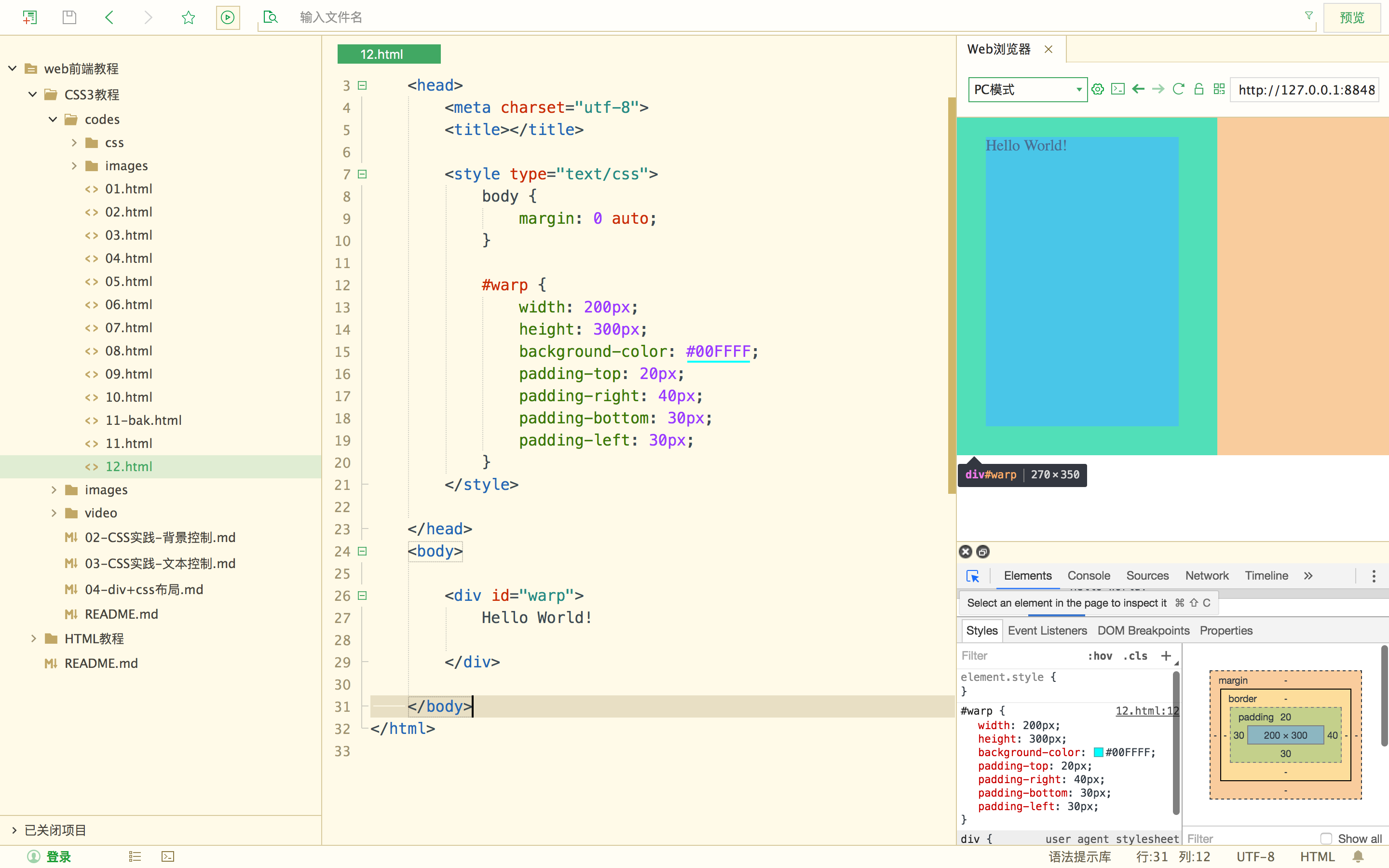
实验效果
当下面的盒子margin-top的值为 100PX ,此时两个盒子的实际值为 100px。
padding 内边距
- padding-top 上边距
- padding-bottom 下边距
- padding-left 左边距
- padding-right 右边距
- padding 上右下左
实验代码
<!DOCTYPE html>
<html>
	<head>
		<meta charset="utf-8">
		<title></title>

		<style type="text/css">
			body {
				margin: 0 auto;
			}

			#warp {
				width: 200px;
				height: 300px;
				background-color: #00FFFF;
				padding-top: 20px;
				padding-right: 40px;
				padding-bottom: 30px;
				padding-left: 30px;
			}
		</style>

	</head>
	<body>

		<div id="warp">
			Hello World!

		</div>

	</body>
</html>
实验效果
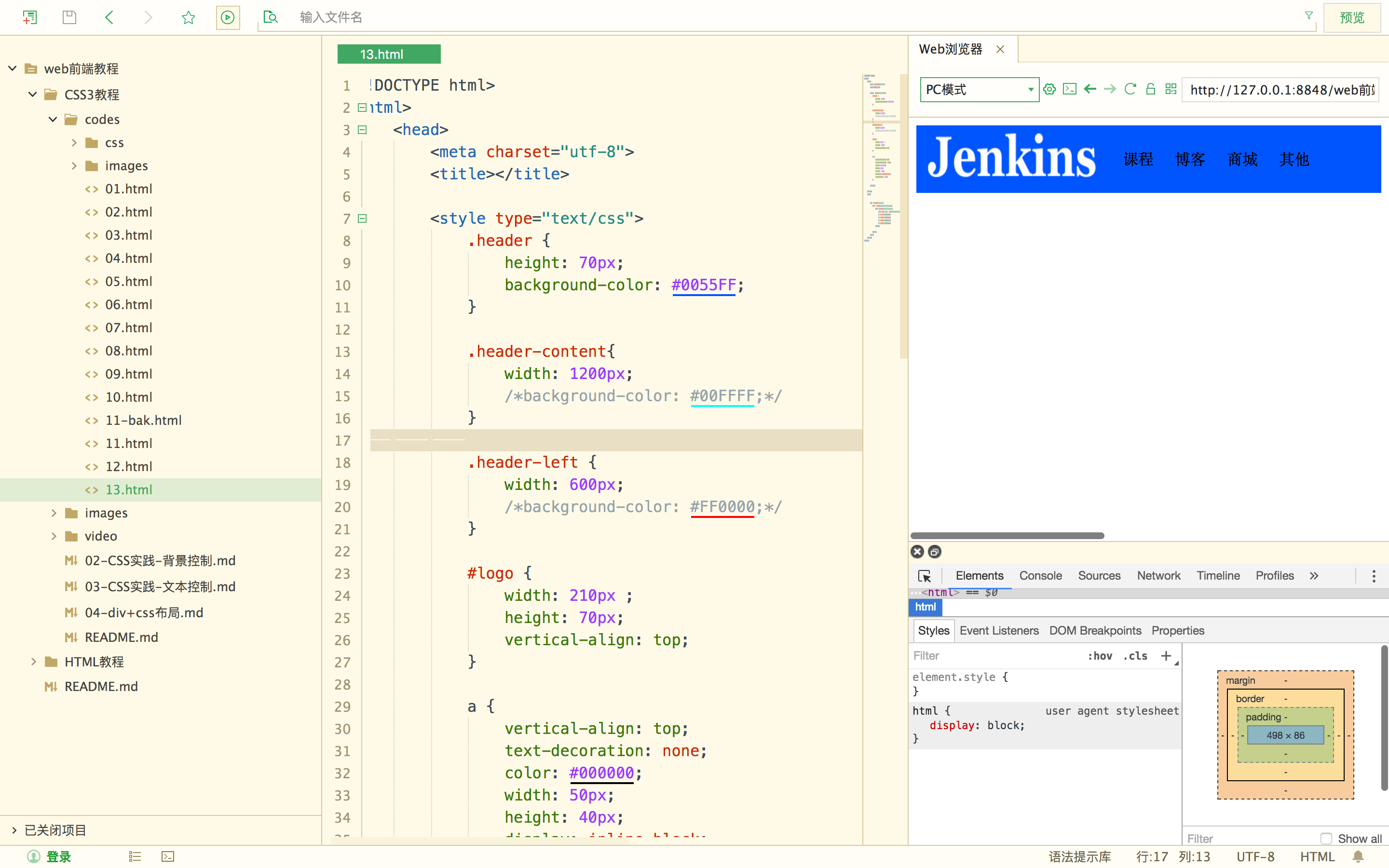
实践: 导航栏
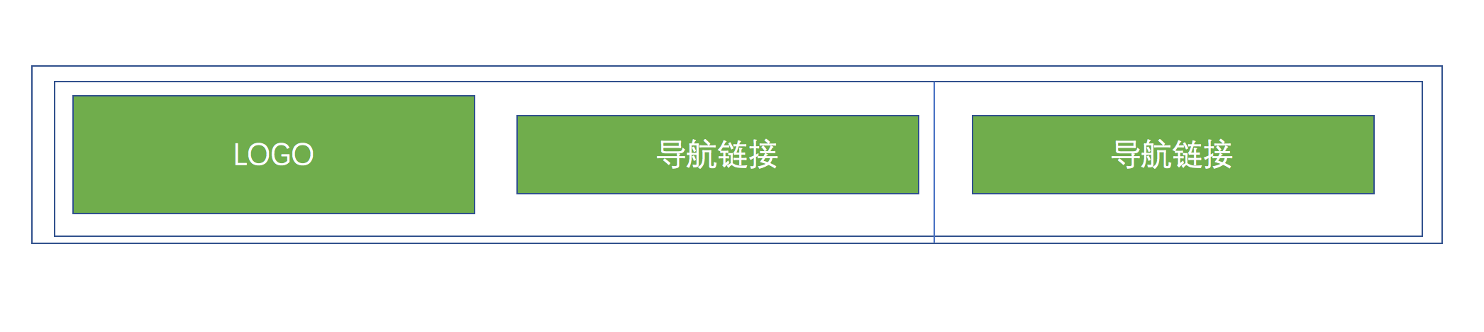
首先我们定义一个头部(header),然后再定义一个div展示头部内容(header-content),一般导航栏也分左右两个部分,我们暂时定义(header-left)左侧导航栏实现。
<div class="header">
			<div class="header-content">
				<div class="header-left">
					<img  id="logo" src="images/title.png" >
					<a href="">博客</a>
					<a href="">商城</a>
					<a href="">新闻</a>
					<a href="">其他</a>
				</div>
			</div>
</div>
定义导航栏样式
	<style type="text/css">
			.header {
				height: 70px;
				background-color: #0055FF;
			}

			.header-content{
				width: 1200px;
				/*background-color: #00FFFF;*/
			}

			.header-left {
				width: 600px;
				/*background-color: #FF0000;*/
			}

		  #logo {
				width: 210px ;
				height: 70px;
				vertical-align: top; /*垂直对其方式*/
			}

			a {
				vertical-align: top; /*垂直对其方式*/
				text-decoration: none; /*去掉a标签的下划线*/
				color: #000000;
				width: 50px;
				height: 40px;
				display: inline-block; /*让a标签在一行内显示 并且支持宽高*/
				line-height: 70px;  /*文字垂直居中*/
			}
 </style>
最中效果
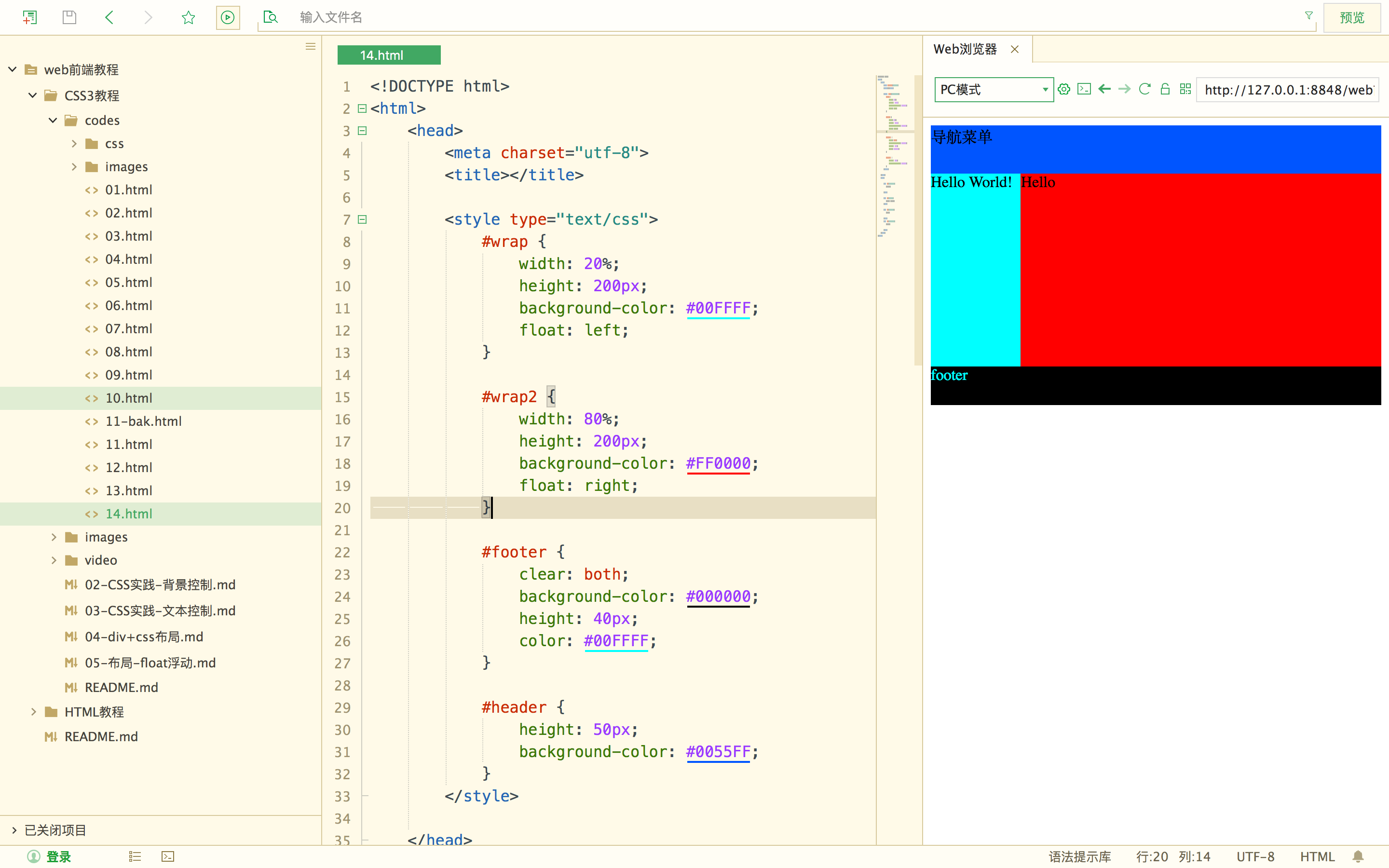
float浮动
什么是float ? 大家在前面有没有发现一个问题,就是我们可以让盒子上下控制,无法左右控制。
对的没错,float浮动就是解决这个问题的。我们一起学习下吧!
- left 左边
- right 右边
- clear : both; 清除浮动
实验代码
<!DOCTYPE html>
<html>
	<head>
		<meta charset="utf-8">
		<title></title>

		<style type="text/css">
			#wrap {
				width: 20%;
				height: 200px;
				background-color: #00FFFF;
				float: left;
			}

			#wrap2 {
				width: 80%;
				height: 200px;
				background-color: #FF0000;
				float: right;
			}

			#footer {
				clear: both;
				background-color: #000000;
				height: 40px;
				color: #00FFFF;
			}

			#header {
				height: 50px;
				background-color: #0055FF;
			}
		</style>

	</head>
	<body>

		<div id="header">
			导航菜单

		</div>

		<div id="wrap">
			Hello World!
		</div>

		<div id="wrap2">
			Hello

		</div>
		<div id="footer">
			footer

		</div>
	</body>
</html>
实验效果
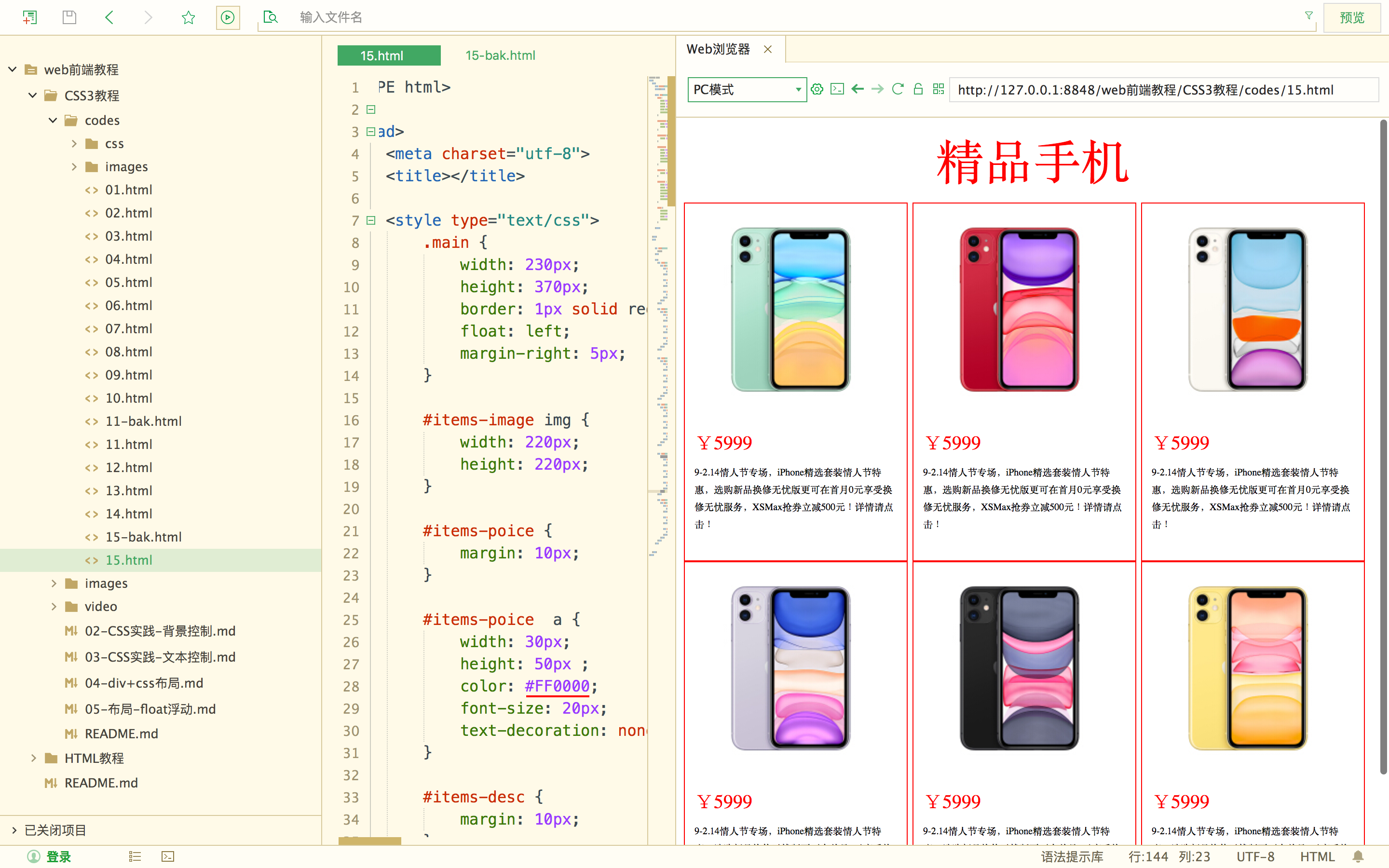
实践练习
展示手机商品
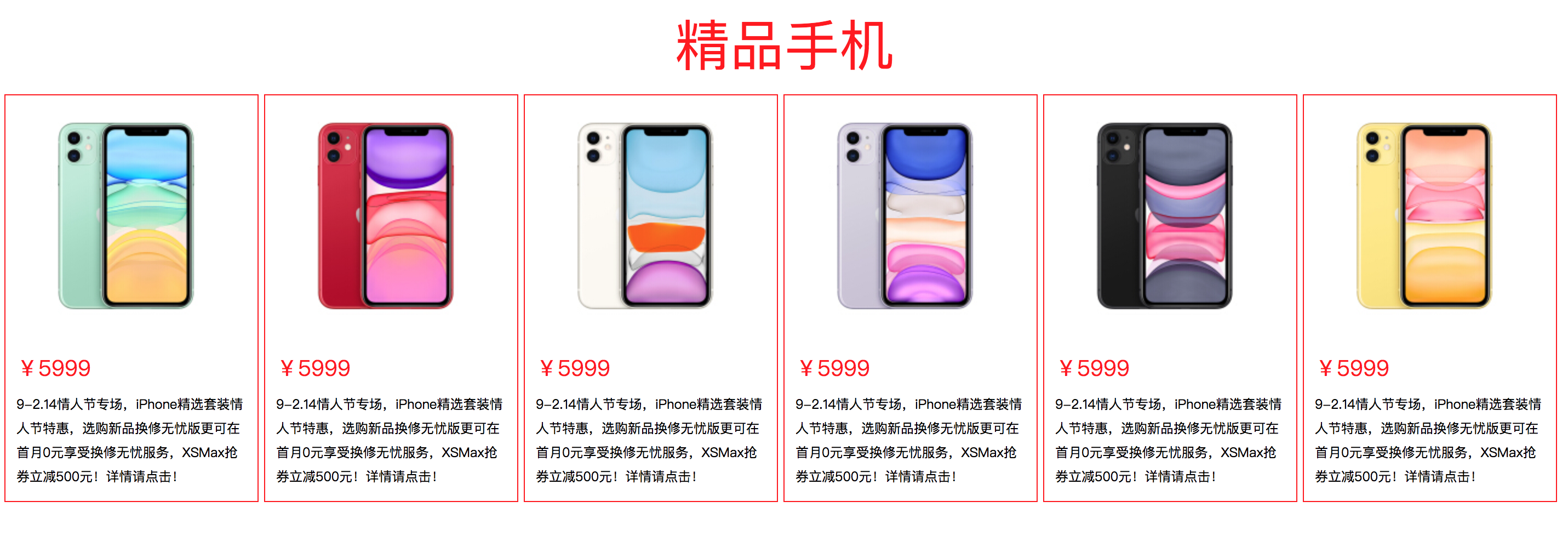
实验代码
<!DOCTYPE html>
<html>
	<head>
		<meta charset="utf-8">
		<title></title>

		<style type="text/css">
			.main {
				width: 230px;
				height: 370px;
				border: 1px solid red;
				float: left;
				margin-right: 5px;
			}

			#items-image img {
				width: 220px;
				height: 220px;
			}

			#items-poice {
				margin: 10px;
			}

			#items-poice  a {
				width: 30px;
				height: 50px ;
				color: #FF0000;
				font-size: 20px;
				text-decoration: none;
			}

			#items-desc {
				margin: 10px;
			}

			#items-desc a {
				width: 100px;
				height: 80px;
				text-decoration: none;
				font-size: 10px;
				color: #000000;
				vertical-align: top;
			}

			.title {
				text-align: center;
				font-size: 50px;
				color: #FF0000;
				margin-bottom: 10px;
			}

		</style>


	</head>
	<body>


		<div class="title">
			精品手机
		</div>

		<div>
			<div class="main">
				<div id="items">
					<div id="items-image">
						<img src="images/iphone.jpg" >
					</div>

					<div id="items-poice">
						<a href="">¥5999</a>
					</div>

					<div id="items-desc">
						<a href=""> 9-2.14情人节专场,iPhone精选套装情人节特惠,选购新品换修无忧版更可在首月0元享受换修无忧服务,XSMax抢券立减500元!详情请点击!</a>
					</div>
				</div>
			</div>

			<div class="main">
				<div id="items">
					<div id="items-image">
						<img src="images/iphone2.jpg" >
					</div>

					<div id="items-poice">
						<a href="">¥5999</a>
					</div>

					<div id="items-desc">
						<a href=""> 9-2.14情人节专场,iPhone精选套装情人节特惠,选购新品换修无忧版更可在首月0元享受换修无忧服务,XSMax抢券立减500元!详情请点击!</a>
					</div>
				</div>
			</div>


			<div class="main">
				<div id="items">
					<div id="items-image">
						<img src="images/iphone-jin.jpg" >
					</div>

					<div id="items-poice">
						<a href="">¥5999</a>
					</div>

					<div id="items-desc">
						<a href=""> 9-2.14情人节专场,iPhone精选套装情人节特惠,选购新品换修无忧版更可在首月0元享受换修无忧服务,XSMax抢券立减500元!详情请点击!</a>
					</div>
				</div>
			</div>

			<div class="main">
				<div id="items">
					<div id="items-image">
						<img src="images/iphone-yin.jpg" >
					</div>

					<div id="items-poice">
						<a href="">¥5999</a>
					</div>

					<div id="items-desc">
						<a href=""> 9-2.14情人节专场,iPhone精选套装情人节特惠,选购新品换修无忧版更可在首月0元享受换修无忧服务,XSMax抢券立减500元!详情请点击!</a>
					</div>
				</div>
			</div>


			<div class="main">
				<div id="items">
					<div id="items-image">
						<img src="images/iphone-black.jpg" >
					</div>

					<div id="items-poice">
						<a href="">¥5999</a>
					</div>

					<div id="items-desc">
						<a href=""> 9-2.14情人节专场,iPhone精选套装情人节特惠,选购新品换修无忧版更可在首月0元享受换修无忧服务,XSMax抢券立减500元!详情请点击!</a>
					</div>
				</div>
			</div>

			<div class="main">
				<div id="items">
					<div id="items-image">
						<img src="images/iphone-yellow.jpg" >
					</div>

					<div id="items-poice">
						<a href="">¥5999</a>
					</div>

					<div id="items-desc">
						<a href=""> 9-2.14情人节专场,iPhone精选套装情人节特惠,选购新品换修无忧版更可在首月0元享受换修无忧服务,XSMax抢券立减500元!详情请点击!</a>
					</div>
				</div>
			</div>
		</div>


	</body>
</html>
实验效果